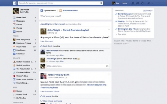
Last year a new design was tested on Facebook's 1.2 billion users which added a dark left-hand menu to mimic the iOS and Android apps, but the company admitted that it "looked cool but didn't help you get around the site". Many users were similarly unenthusiastic and Facebook claims to have taken that feedback into account when designing the latest update.News Feed product manager Greg Marra told The Verge: "People don't like us moving their furniture around, because you break muscle memory".That left-hand menu has now been simplified, with many options including Photos, Pages and Apps removed. Photos are also displayed larger in the News Feed and new fonts (Helvetica and Arial) are used.Some accounts have already been moved on to the new design and Facebook hopes to complete the migration within a few weeks.Earlier this year Facebook launched a new app called Paper which radically overhauled how users viewed status updates, photographs and videos posted by contacts and also brought streams of curated news content from a range of partner publications.Facebook Paper allows you to navigate through your news feed item-by-item with the swipe of a finger. Images appear full-screen with accompanying captions overlaid, and users can pan from left to right simply by tilting their device.Any videos in your news feed also appear full-screen and play with captions overlaid in a similar way to images. At the bottom of each page are “like”, "comment" and "share" icons, but no other screen furniture is displayed.The new website design shows that while Facebook is looking at new ways of displaying information on mobile devices, it also recognises that a back-to-basics approach seems to work on the desktop.Marra said: "We recognise that while we strive for design consistency, part of that is recognising that the way you use things on a PC is different from how you use things on your phone. But it's important that we cut these from the same cloth."(telegraph.co.uk)ANN.Az
Facebook unveils simplified News Feed page
Business
19:30 | 07.03.2014

Facebook unveils simplified News Feed page
Facebook has unveiled a new, simplified website design which does away with previous attempts to unify the increasingly popular mobile app with the desktop version of the social network.
Follow us !


