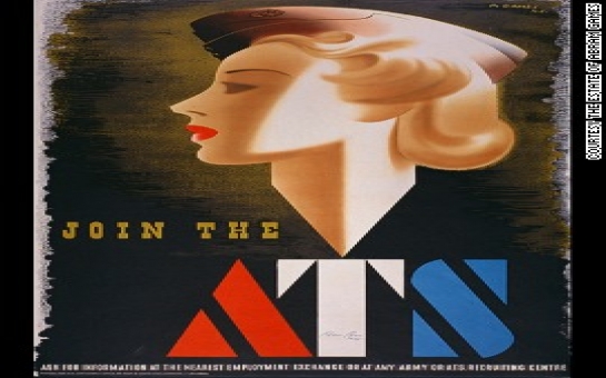
You'd be forgiven for not knowing it was then that five of the world's top poster designers were born: Tom Eckersley, Abram Games, FHK Henrion, Josef Müller-Brockmann and Paul Rand.Though they were from different backgrounds and worked separately, the five are largely responsible for bringing modernist design and typeface sensibilities to the world of poster design from the 1940s on."It was a sort of Golden Age of the poster," says legendary letterpress designer Alan Kitching.While their names have all but slipped from public memory, a new project from Kitching and Monotype, one of the world's leading typeface design companies, is shining a new light on their revolutionary poster work, 100 years after their birth.The results: a series of posters fusing each designer's style with Kitching's, and "Alan Kitching and Monotype: Celebrating the centenary of five pioneers of the poster," an exhibition at the London College of Communication for the London Design Festival, that will showcase Kitching's work alongside posters from each designers' estate.The artist at workI meet Kitching at his workshop near the London College of Communication. The smell of ink and metal hits you at the door, growing stronger as you move closer to the intimidating printing press in the back. Prints of his work—eye-popping text images in rainbow hues—hang from the walls, the ceiling, a drying line. The hundreds of typeface alphabets he's made and amassed over the years (the largest collection in Europe), from indecipherably small metal nubs to wooden letters the size of a man's forearm, are filed away in stacked tiers, and leaned against walls. His only computer is a first-generation MacBook he uses to check emails.Over the last 50 years, Kitching has built a reputation as one of the world's most acclaimed letterpress designers. And like the designers he's commemorating, he's inspired by the beauty of type."The printed word is still powerful," he says. "I wanted to take letterpress technology and move it somewhere else from when it used to be useful."This dedication to type as art is evident in the prints he created for the collaboration. The colorful posters meld Kitching's penchant for monograms ("I like that idea of monograms: two letters interacting to make a third image,") with each designer's spirit. Their influences resonate like a baseline: Games' initials feature the bold font made famous by his posters for the Auxiliary Territorial Service (the women's branch of the British army) during World War II; Rand's feature the colorful simplicity that he would later bring to children's books.Posters, now and thenKitching is quick to distinguish his posters from those being commemorated. While he has done functional posters, most of his have been designed as prints, strictly things of beauty. But earlier in the 20th-century, when the designers were first breaking ground in graphic design, posters were society's primary form of communication."There were no other means of getting your message out there then. It was just posters," he says.In a time before the ubiquity of photography (let alone Photoshop), good design was paramount. It was all about the "interpretation of an idea in a graphic way."For these artists, this interpretation was realized through geometric shapes, meaningful text and inventive use of color. The diversity of their work proved these principles could be applied for almost any cause, from Eckersley's simple-but-effective posters for the Royal Society for the Prevention of Accidents, to Rand and Henrion's branding work for IBM and KLM respectively; from Games' provocative war propaganda to Müller-Brockmann's geometric orchestra adverts."There's nothing between the message and the image. At a glance, you've got it. You didn't need a lot of words. The image is the message," Kitching says. "That's what they were masters of: condensing down a problem to a single cool item with bang."The public generally responded positively (Games' Guinness posters were universal favorites), but each designer received their share of push-back. One of Games' ATS recruitment posters was recalled after only a few weeks because authorities thought the glamorous woman shown sent the wrong message about the war effort, and another depicting a young boy in poverty was banned by Winston Churchill himself for being too negative.(CNN)Bakudaily.Az
One hundred years since the 'Golden Age' of posters began - PHOTO
Culture
22:45 | 17.09.2014

One hundred years since the 'Golden Age' of posters began - PHOTO
1914 was a good year for poster design.
Follow us !


