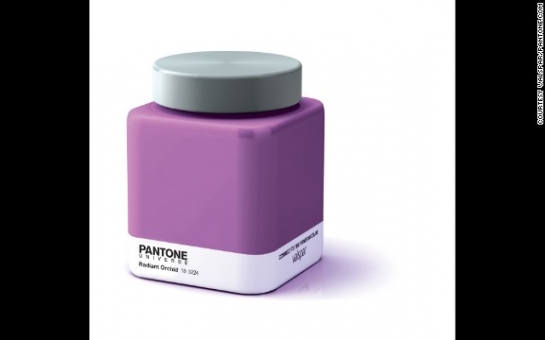
I'm really not sure how I feel about the color purple. It's elegant and regal, but part of me also wants it to die in a ditch.No offense to our mountain majesties or eggplants. But, really, purple is kind of a confused, soulless color that, deep down, wishes it was blue, yet can't shake the fact that somewhere down on the family tree one of its relatives had hot, unprotected color sex with red."I shall not deny my feelings for you.""That's great, Blue. But what's with the leather chaps?"Love it or hate it, get used to it. Purple is going to be big in 2014, at least according to our color overlords at the Pantone corporation who recently announced the upcoming color of the year: Radiant Orchid.With its "enchanting harmony of fuchsia, purple and pink undertones," Radiant Orchid actually seems rather zen and peaceful. But it also sounds exotic and, dare I say, mildly hallucinagenic.Trust me, someone at CU-Boulder will find a way to smoke this color.Now, if it all seems a little weird to you -- the fact that there even exists a color of the year -- understand that Pantone, headquartered in Carlstadt, New Jersey, heralds itself as "the global color authority and provider of professional color standards for the design industry."Basically, the company name has become synonymous worldwide with color language and communication. That means a designer in Denmark can say to a manufacturer in Pittsburgh, "We want all of our widgets to be Pantone Winter Booger" and they'll both know exactly what that looks like.That's assuming Winter Booger is actually a shade of green in Pantone's official palette. If it's not, it should be.I have several samples under my desk.Regardless, Pantone 18-3224, Radiant Orchid, is apparently the big color for next year.And why? Because they said so.Granted, there's a lot of research that goes into this big decision, for choosing a color of the year is slightly more involved than just asking your buddy, Dave, to decide."Orange.""Can you be more specific, Dave?""You know, like an orange."It has to be bigger than that. After all, this is the one color that will supposedly express "what is taking place in the global zeitgeist"Thus, to finally crown Radiant Orchid, Pantone searched the world over for design and color influences, pulling ideas from entertainment to technology. And, in the end, viewing the planet as one big global community, they decided, "Welp, this is sorta where we're at."Purple.Of course, Radiant Orchid marks is a drastic departure from 2013's wild and daring color of the year, Pantone 17-5641 Emerald. Which, I submit, looks astonishingly close to Winter Booger.Perhaps as a return to civility, Radiant Orchid appears somewhat closer to 2012's color of the year, Pantone 17-1463 Tangerine Tango."Can you be more specific, Dave?""You know, like a tangerine tango."Really, I have no idea what the hell any of this means. But, especially to those in the design community, it matters. And, somehow, as a brand, Pantone has actually become culturally iconic. At least in certain circles.In fact, now you can literally buy accessories like mugs and iPhone cases that are intentionally designed to look like a Pantone color swatch.It's sort of like getting your favorite element from the periodic table printed on something because, damn it, you love Boron.But, Pantone merchandise, in a way, actually makes sense. I mean, why not express and represent yourself with a color. Perhaps asking one's Pantone will even become a part of our lexicon."Hey man, what's your Pantone?""Oh, I'm not wearing pants today."
So, in 2014 keep an eye out for purple. From fashion runways to websites to living rooms, Radiant Orchid is going to be everywhere. That, and Winter Booger.
Well, maybe not everywhere. But definitely under my desk.
(CNN)
ANN.Az


