The Facebook app icon is now among the most recognisable in the world, but as more people use the service on their phones and tablets, the full, written logo is rarely seen anymore.
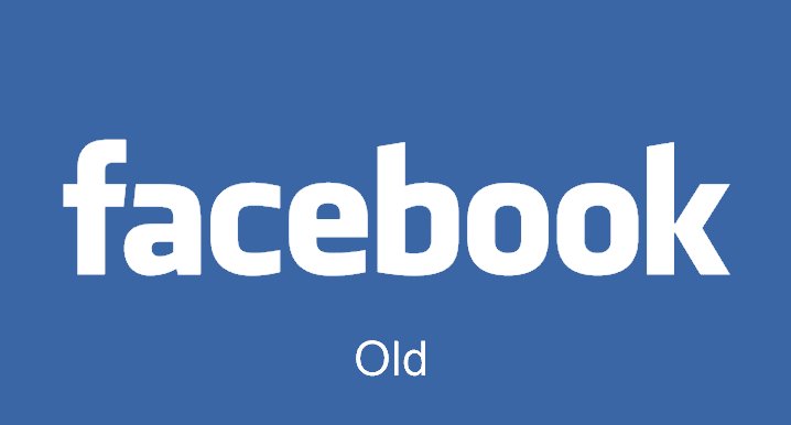
But last night, a Facebook product designer tweeted this logo's latest design with changes that are so subtle you may not even notice them.
Christophe Tauziet's tweet said: 'Say hello to the new Facebook logo' and he later responded to a question about when we will see the update with 'soon.'
The blue and white colours have remained the same.
Facebook has swapped the double-storey 'a' on the previous logo for a single-storey version.
This seems like an unusual change because the double-storey version is how the letter is typed - and is used across computer fonts including those on Facebook - while the single-storey is more commonly seen in handwriting.
By comparison, the 'b' now has a terminal and more closely resembles a typed version.
Other subtle changes include making the edges sharper and increasing the logo's width.
MailOnline has contacted Facebook for more information about why the changes were made and when the update will be seen.
Earlier this month, Spotify also made a relatively subtle change to its logo but it caused a big reaction on social media.
The colour was changed to a lighter, brighter green and a Spotify executive was forced to reveal why the changes were made.
Paul Moulton, head of copy at the music streaming service, said a huge team scrolled through more than 5,000 shades - some of which were immediately dismissed as reminiscent of Kermit or Shrek.
Despite this, hundreds of users took to Twitter to vent their frustration at the change with some saying the 'alien green' colour makes them want to 'kill themselves'.
Mr Moulton said: 'It has been a long process over several months and we have looked at a lot of greens,' he said.
'We would go through each colour in turn and brainstorm whether we thought it was right.
'This inevitably led to a lot of hilarious conversations. For example when one fairly bright shade of green was discussed someone immediately yelled out 'Kermit'.
'We all started laughing and realised instantly that we wouldn't be able to use it if it reminded people of a famous Muppet character.'
He said that another colour which stuck out in his memory was a dark brown green shade which someone said looked like 'weed'.
During another discussion, he said one green looked very promising until one team member said it reminded him of Shrek.
The executive said the change to the icon was all part of a much larger shift in the overall visual identity.
More than 100 Spotify creatives and designers worked on the decision - which was seen as a small but 'crucial change'.
(dailymail.co.uk)
www.ann.az
Follow us !